


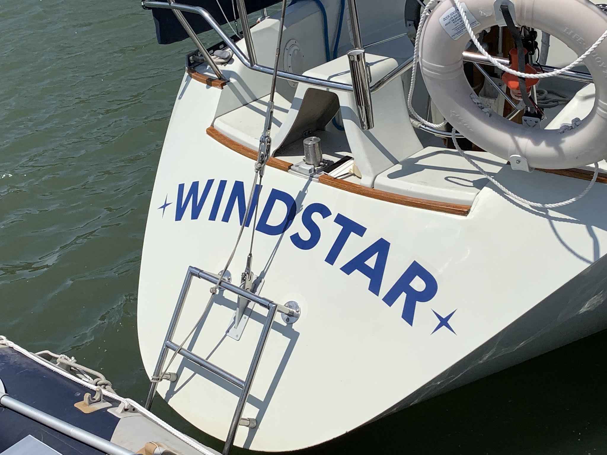
The graphics were likely installed in the late 1980's and looked ok from afar but far from OK up close. Time to refresh!
Below are the fonts and materials chosen, and the specification provided to Derrick at Edgevinyl. the screen font may not be 100% accurate.
1) - To be
used for topsides, port and starboard. Existing
letter height 7”, baseline width 53”. W is
9 7/8” across its top, line weight 2 ¾”.
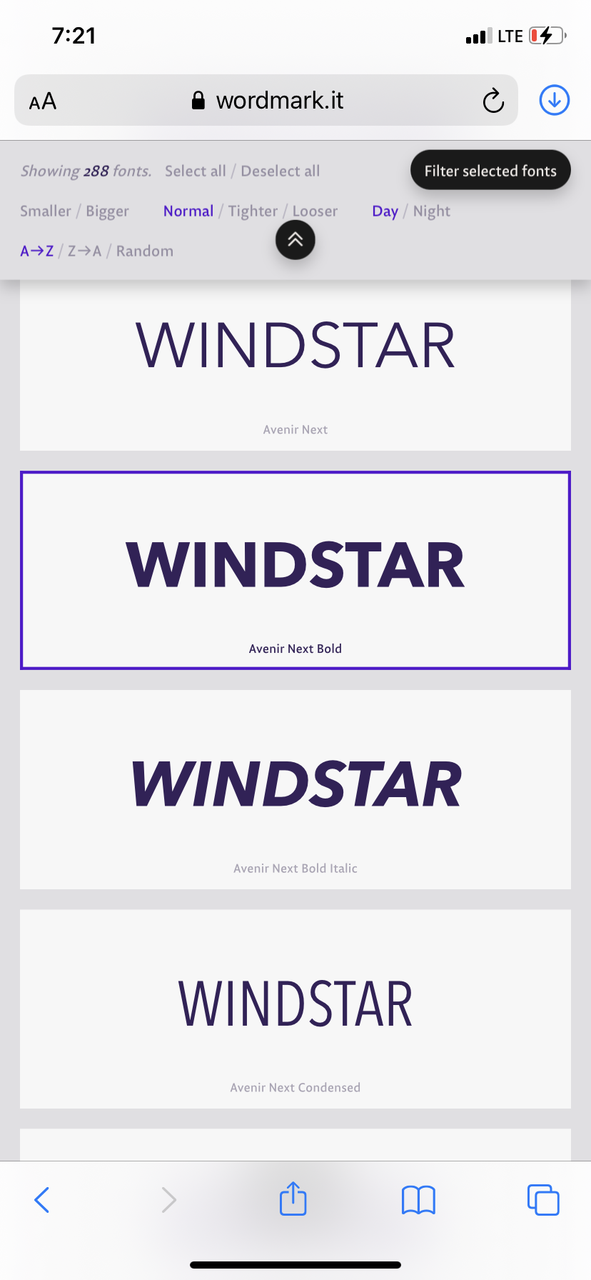
a. Font below
is Avenir Next LT Pro bold italic.
WINDSTAR
2) - To be
used for transom, letter height 6”, approx. 74” radius, baseline width (chord) approx.
45” as per current. W is 8 3/8” across top, line weight is 1 9/16”. (note - this was later determined to be an elliptical arc, so the radius is not a constant 74")
a. Font below is Avenir Next LT Pro bold.
WINDSTAR
3) - To be
used the reg numbers on either side of the bow, and also for the transom, applied below name horizontally as is currently. Letters are 3” high, line weight ½”.
a. Font below is Avenir Next LT Pro Demi.
b. As there will only be one row of text, letter
height should increase to 4”.
TORONTO


No comments:
Post a Comment
Comments and corrections welcome!